Branding, Responsive UI/UX Design
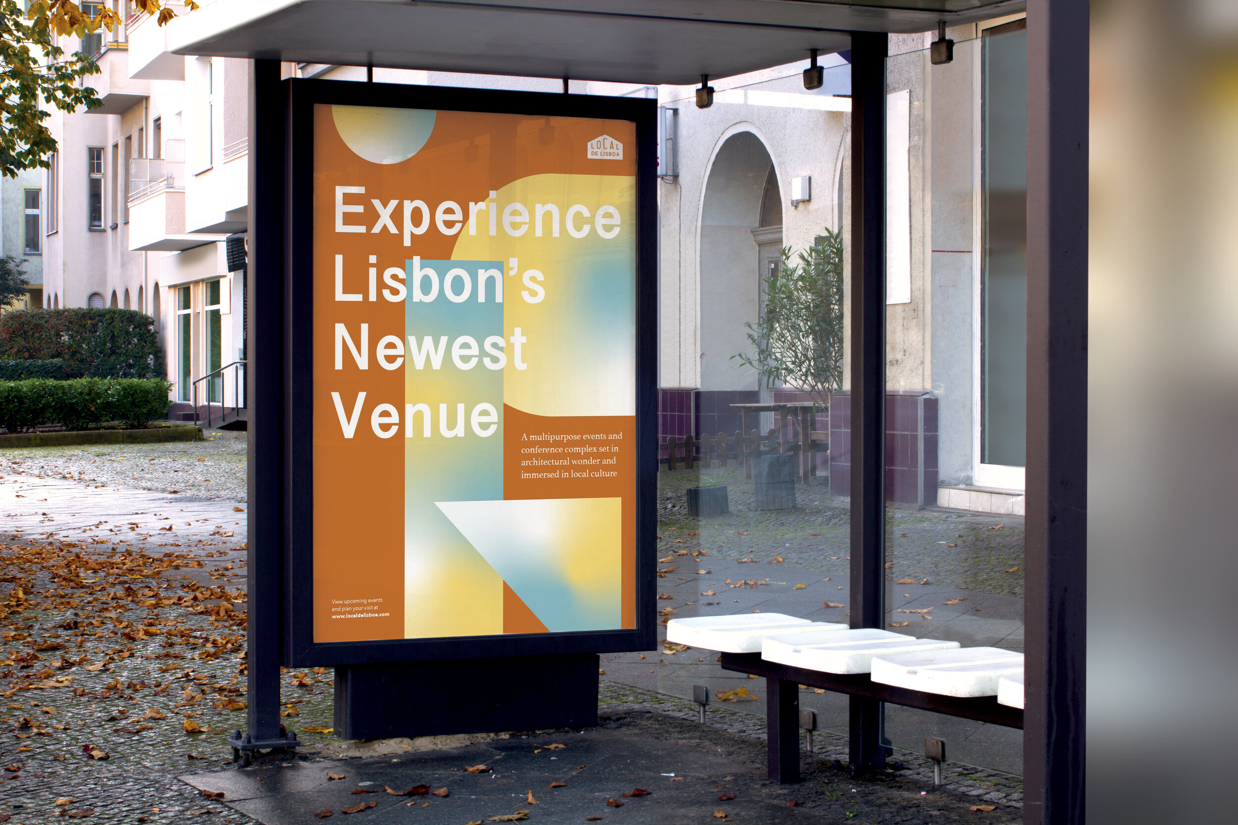
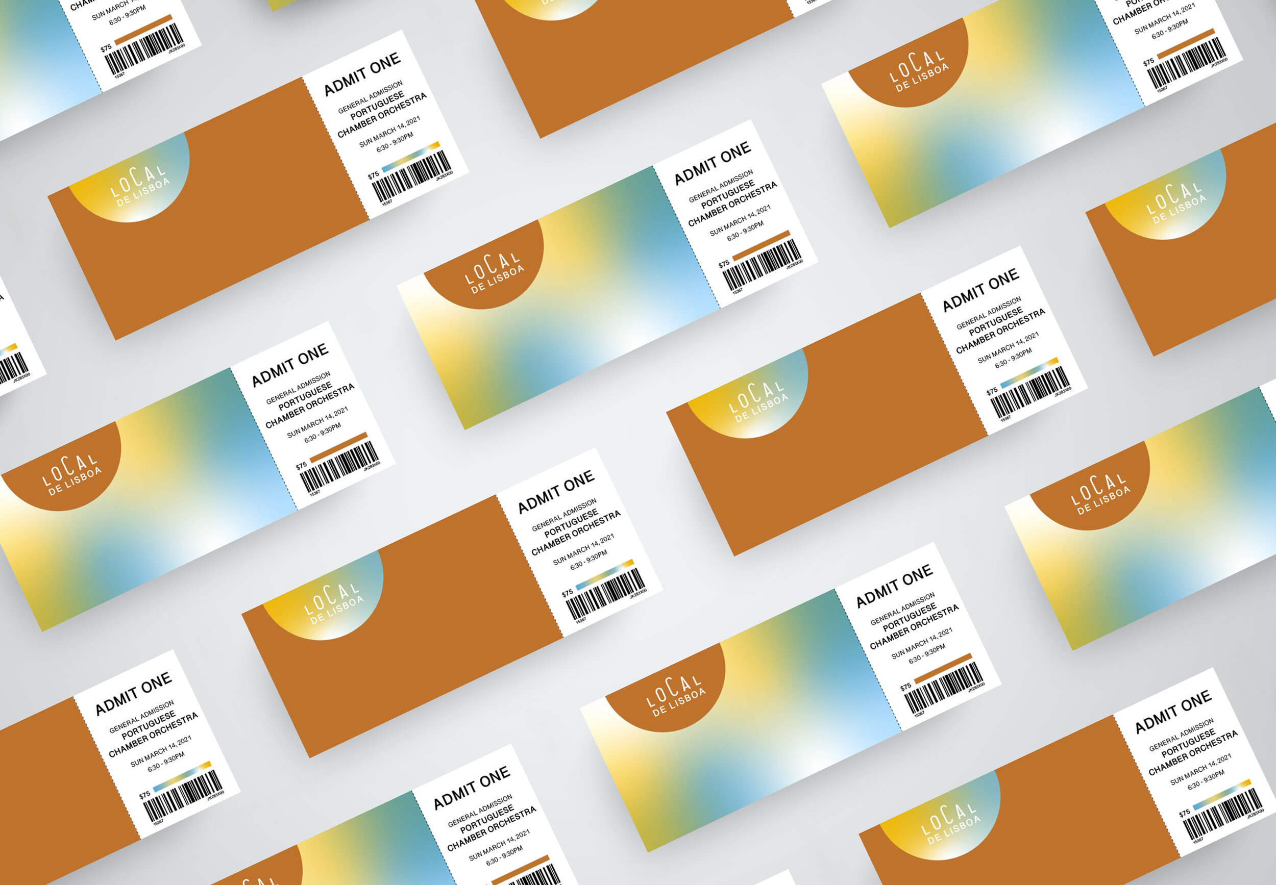
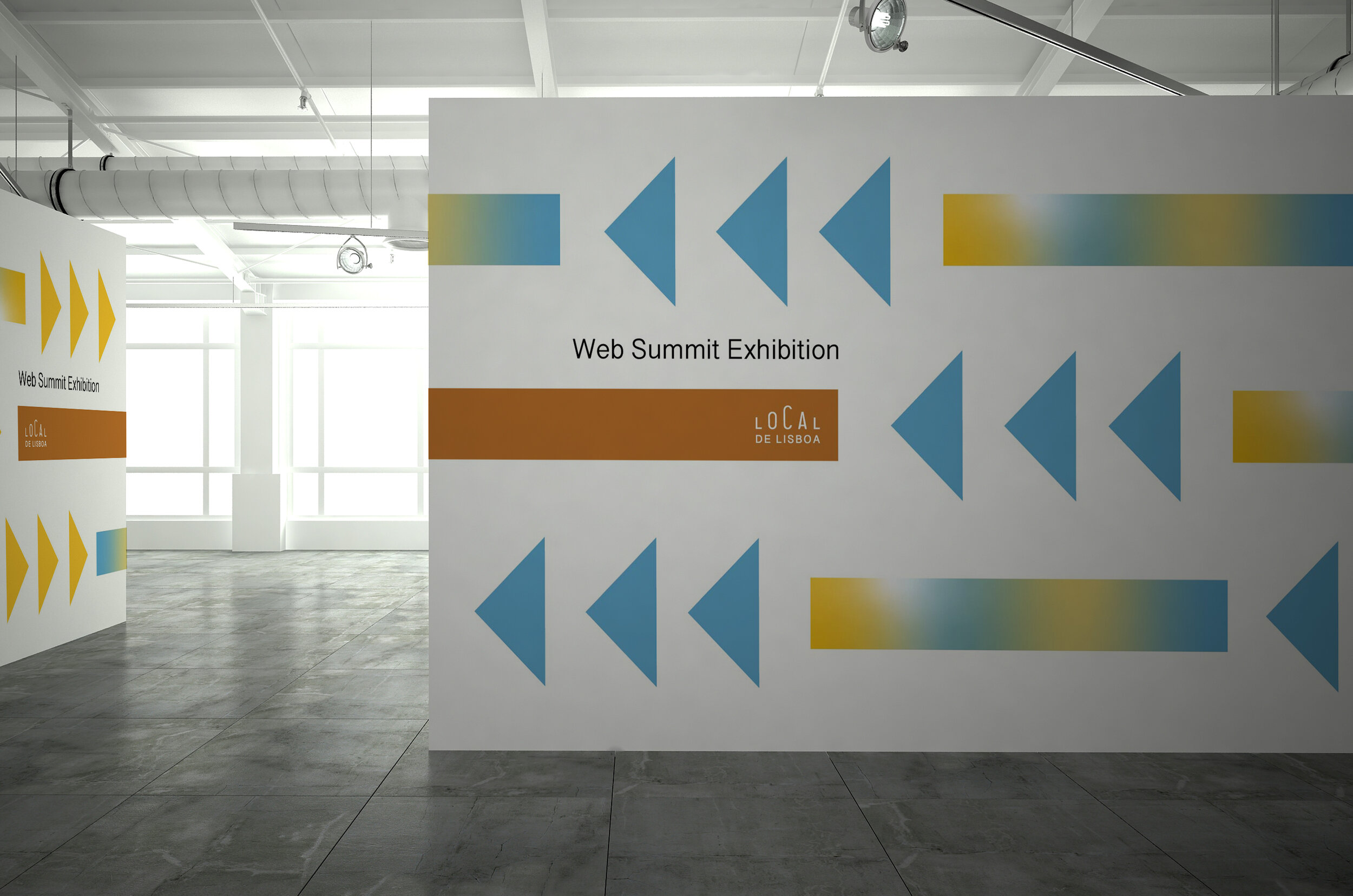
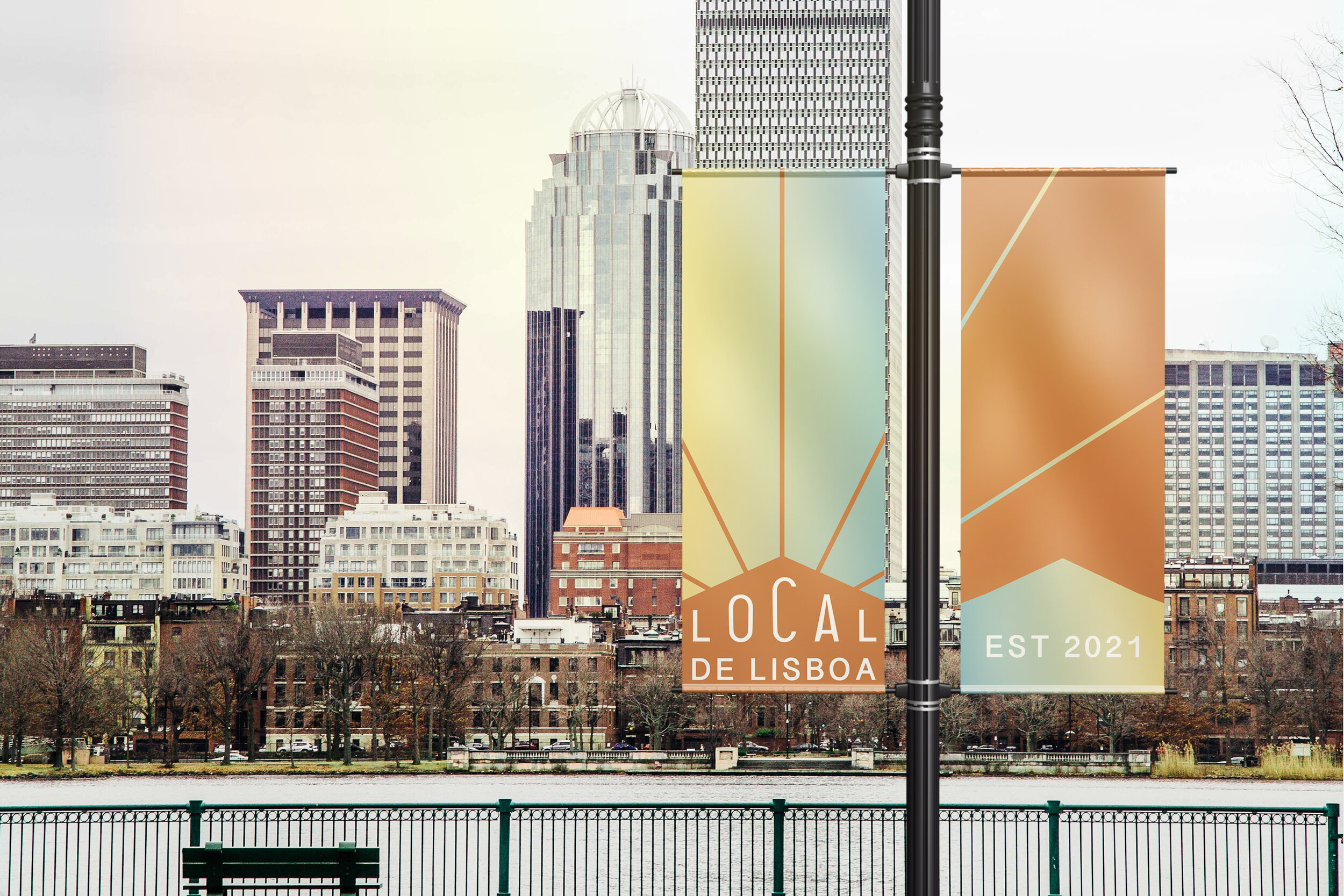
A new multipurpose events and conference complex opening up in Lisbon, Portugal needed a corporate identity created. The goal was to have the venue become a cultural and business hub in the area so the identity had to be flexible for a variety of collateral. The brand needed to evoke the exciting possibilities that the venue has to offer.


When researching Lisbon, Portugal and venues in the city, I was drawn to the architecture and colors. With the shapes of architecture found in Lisbon as the foundation, the color palette drove the design home. The burnt orange represents the rooftops, the blue represents the coast, and the yellow represents the color often found on buildings and the trams. The addition of gradients expresses all of the exciting possibilities that the venue has to offer. This shape and color system was then rolled out to create a cohesive brand.


