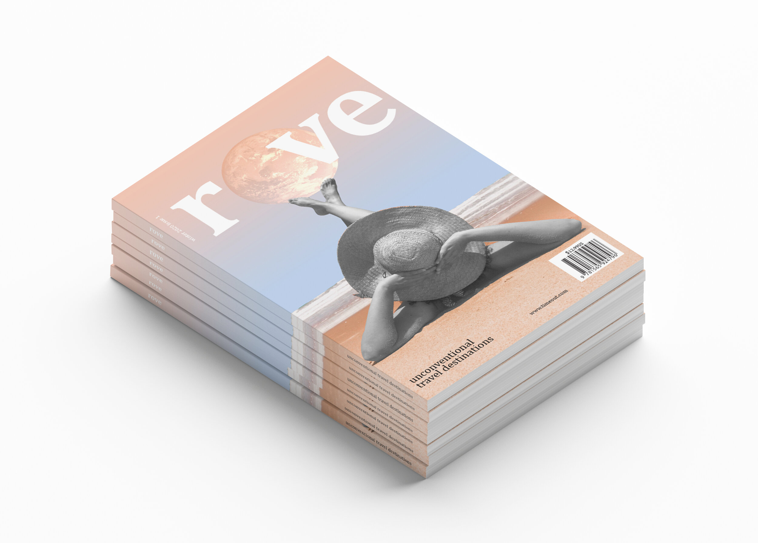
Editorial Design, Typesetting
Time Out Magazine started out as a counterculture magazine with rebellious roots. For their first travel guide magazine about Unconventional Travel Destinations they wanted to speak to a demographic of curious, open minded travelers who loved culture.
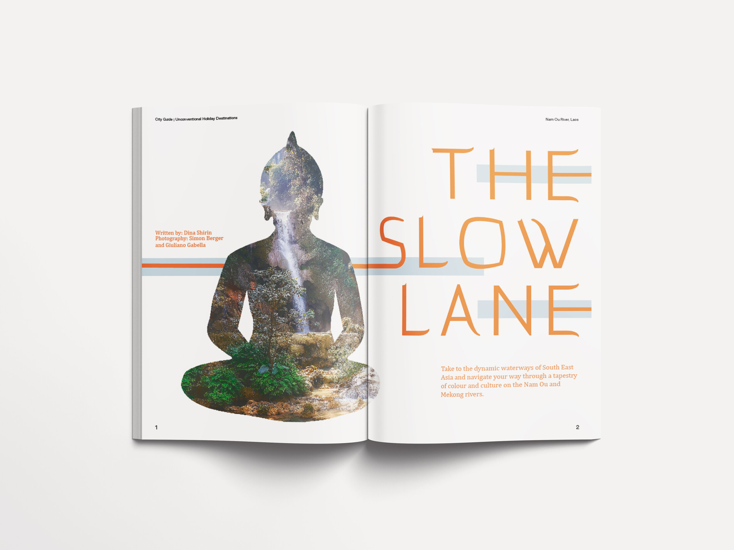
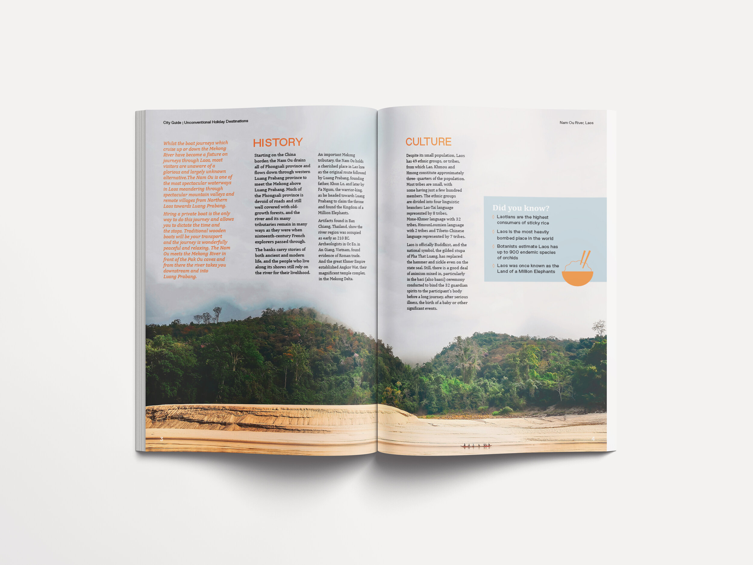
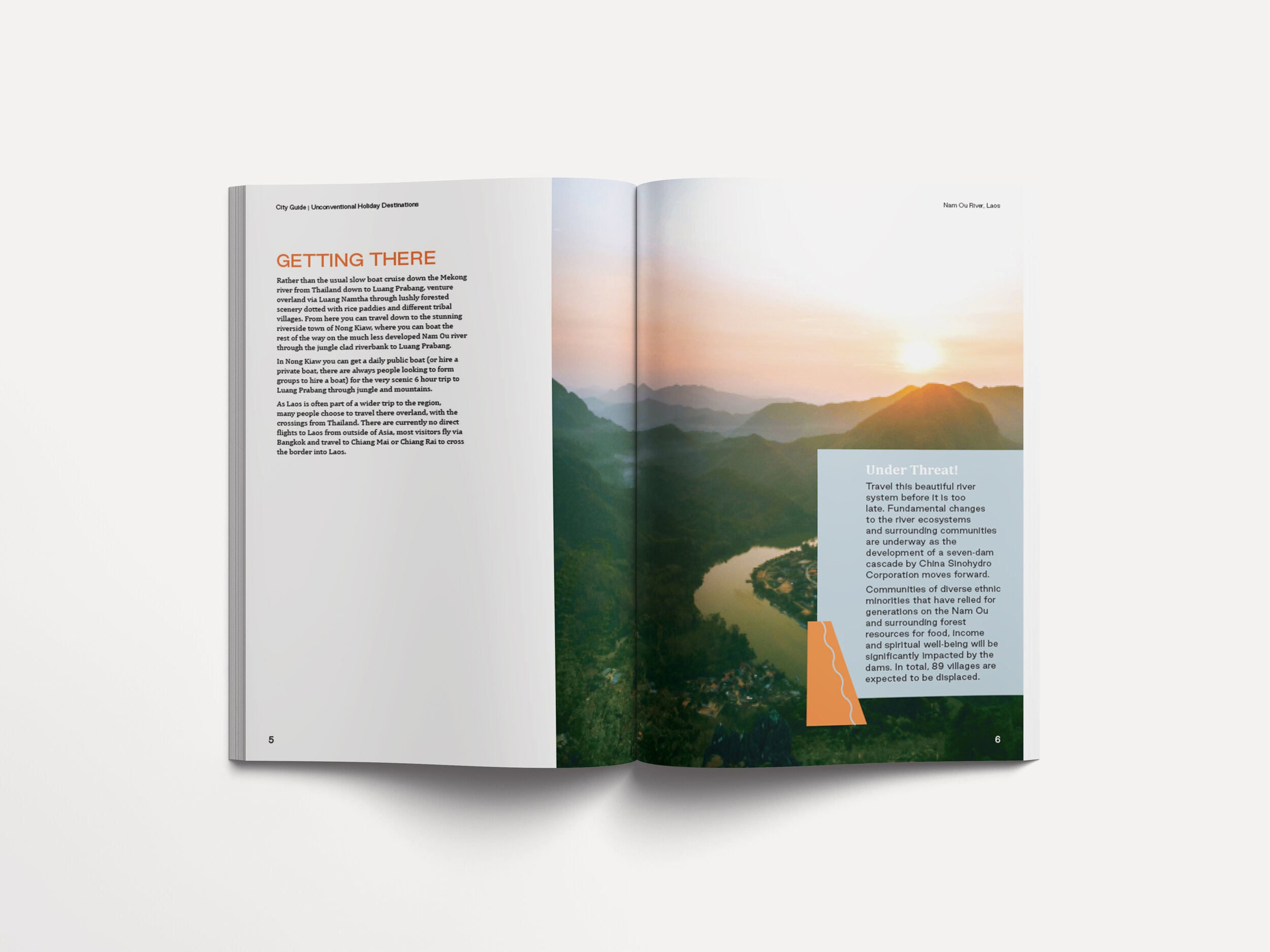
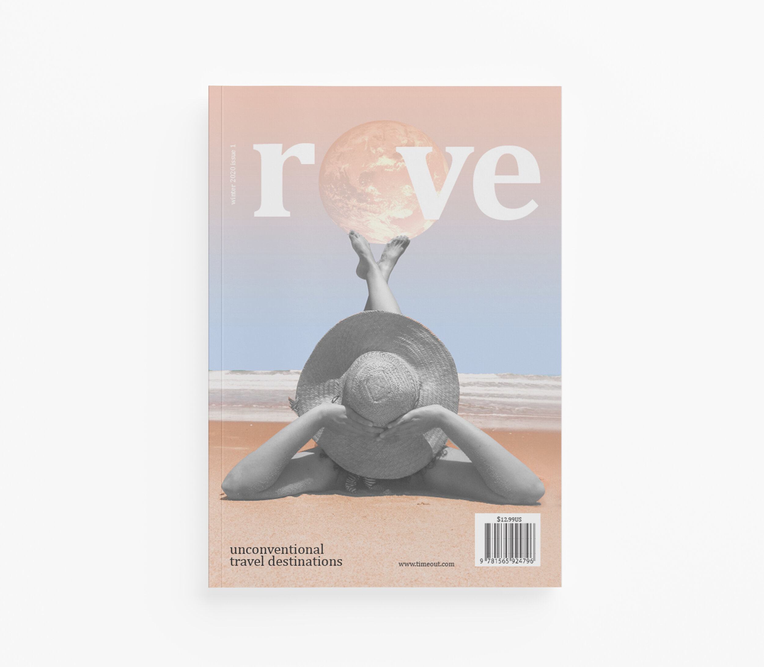
Rove means “to wander and travel constantly without a fixed destination” so it is the perfect choice for a magazine with a target audience of curious, open minded travelers. The visual on the cover with the woman at the beach with the world representing the “o” in the title puts further emphasis on this sentiment. The type lockup paired with a scenic image imposed into the buddha frame for the featured article accents the importance of culture to the reader. Furthermore, the large images in the spread transports the reader with ease to the featured location. With clear hierarchy and typesetting, the reader knows where to start and finish their reading experience.
